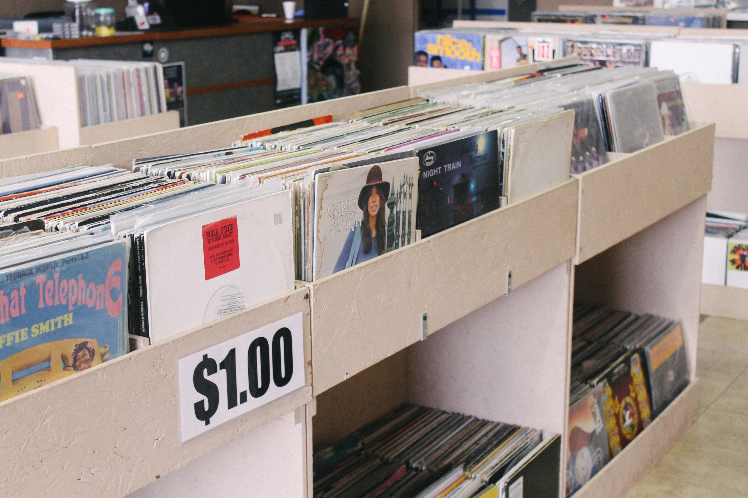
Sterling Bartlett has been a friend and favorite artist of ours since Hit City U.S.A.'s beginning. There might not even be a Hit City U.S.A. without him. He designed our early logo (as well as our newest revision), countless pieces of work for The Franks, Kisses' Rest In Paradise album art, and, most recently, this amazing flyer for our upcoming 'Something Good' event on Nov. 27 with portraits of performers PAPA, Astronauts, etc., and Maxim Ludwig.
Without gushing too much, he's just one of the coolest dudes you'll ever know and an amazingly inspirational artist on top of it all. In short, he makes us all better. So when he recently unveiled a new style that was totally different from the sort of stuff he'd been doing for years, we wanted to hear what sparked the change and get a sense of what more's to come.
Sterling recently released a new book called ABCs for Ten Seconds Ago — you can also follow him on Instagram.

"Points" — It's not always a straight line.
Working as an illustrator in the 21st century is a strange and nebulous job. You must be proficient as a draftsperson, develop a signature style, master an array of physical and digital tools, and possess at least a working knowledge of graphic design, web design, and more. All of these skills can still seem subordinate to trading in a kind of sub-cultural wisdom, navigating, and sorting an increasingly rhizomatic field of references.
Miles Kington said, "Knowledge is knowing that a tomato is a fruit, wisdom is not putting it in a fruit salad". As an illustrator this means knowing how to compartmentalize sets of visual cues, and save them for different applications: Working on a country music promo poster? Opt for old circus display fonts and add a distressed look. Hired to design a street wear tee? Choose primary colors, and flip a popular '80s toy logo. Metal album? Skulls. Every time.

"Tyler" — I re-did this one three times. He has a sort of hard to capture look in his eye. I got close here.
After almost a decade working for these outlets, (among others) the soft pencil hand-style I was known for became linked inextricably to these jobs. This meant sitting down to make work for my own enjoyment became difficult, if not somewhat distressing.
I couldn't help but associate this new work with previous clients, or attach certain outside connotations to what I was making even as it was being laid onto paper. I became alienated from my own output.

"Emily & Carlos" – I took this photo while we were having dinner. I think Carlos is either telling a dirty joke or talking shit here.
I took a break from making any personal work for a while and just read. I read theory, art criticism, and a little bit of art history. I read about print-making and recalled some basic prints I did back in college. I bought some printing supplies, and began experimenting.
Using a technique called monoprint, I laid out a series of abstract forms onto large sheets of thick bristol paper. The initial prints were used simply as backgrounds for charcoal drawings. After I became more comfortable with printing, and pushing it a bit further I landed on a hybrid approach employing aspects of monoprinting, rudimentary screen printing, and drawing to make the final image.

"BPathos" — Pathos? Bathos? Either way...
This is where I've landed recently. The final outcome is far more abstract than I'm used to. Forms aren't perfect, color is exaggerated, and registration is generally off — all no-nos in my previous work.
The subject matter is also miles away from what I am generally hired to do professionally. These have little to do with intricate subcultures, or popular music. Most of my recent work centers around portraits of friends, house pets, or short pieces of text outlining odd ideas that strike me. I'm on a realistic learning curve, and I know I've got a ways to go to develop this style, but I am thoroughly enjoying making work in this vein.

"Mark" — Mark is a painter who works pretty much non-stop. I tried to capture a little bit of that vibe, dude looks existentially tired

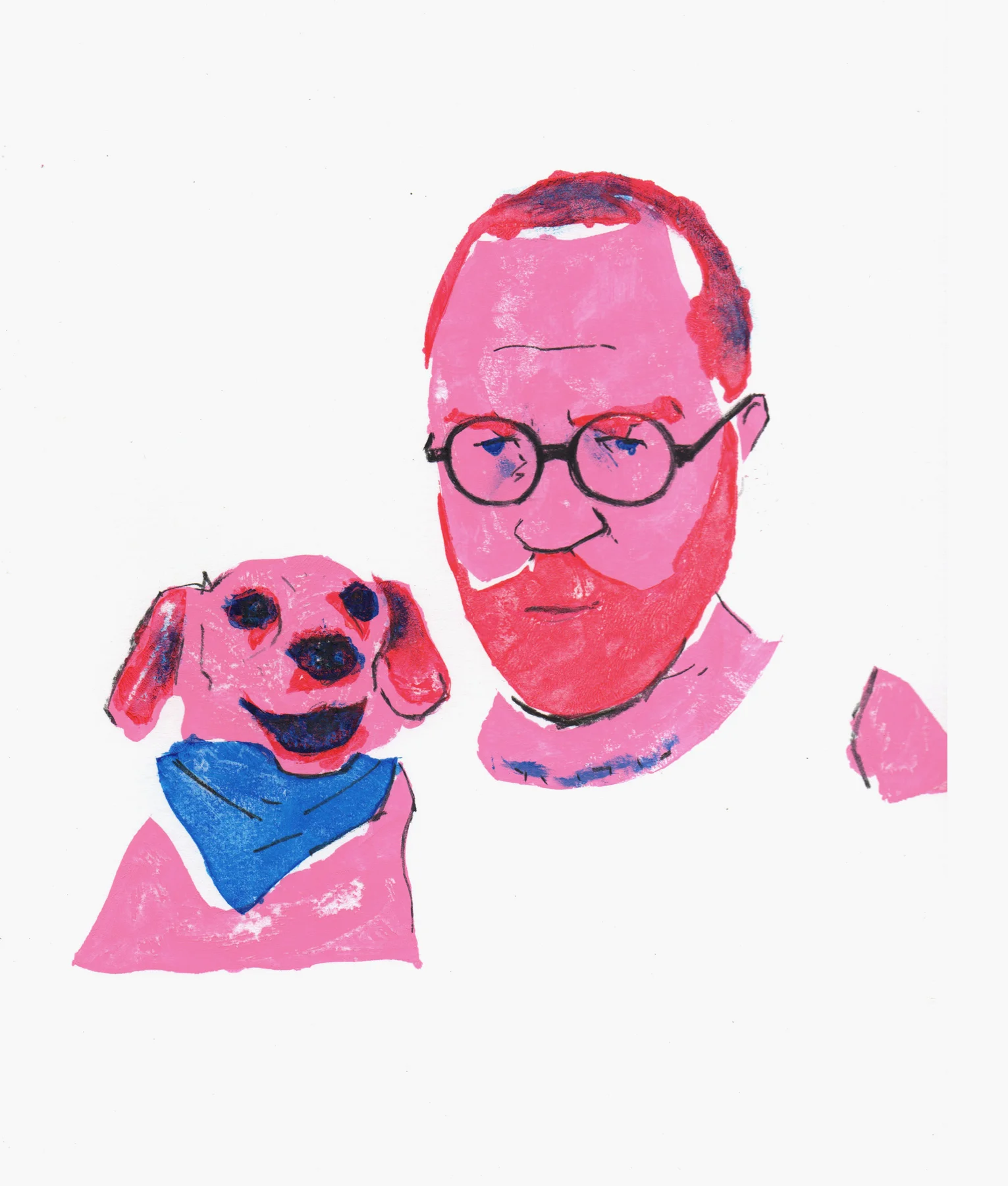
"Self Portrait with my dog Clever" — This is a favorite because it was the first portrait I did in this series and I think it really captures little dude's expression. He is a living Harvey Ross Ball drawing.